Jersey Designs
These are rough graphics that would need to be reworked to fit the jersey design process limitations. These represent some of the general ideas I created that should be enhanced by an individual advanced in graphic design and familiar with the Texas Stars brand, logo, and font standards.
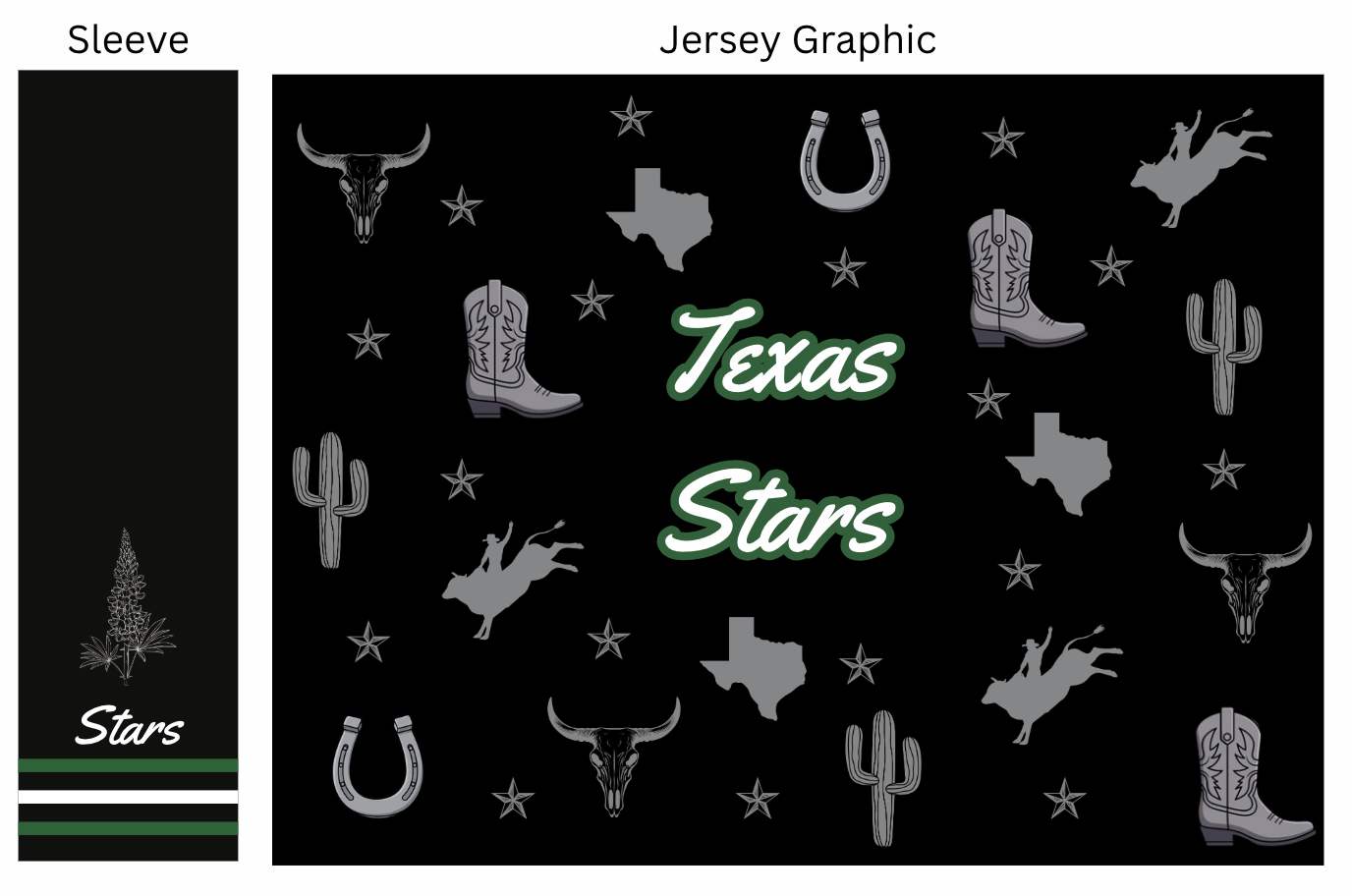
There are aspects of this that could be better represented in the physical design that are missing here. In my mind, the small gray graphic icons would fade into the background better as more of a backing pattern, The font and brightness of the logo should also be shifted with that as well. In the sleeve, the bluebonnet would have less detail and be more of a drawing style. It should be simple enough for printing but still easily identified as a Texas Bluebonnet.
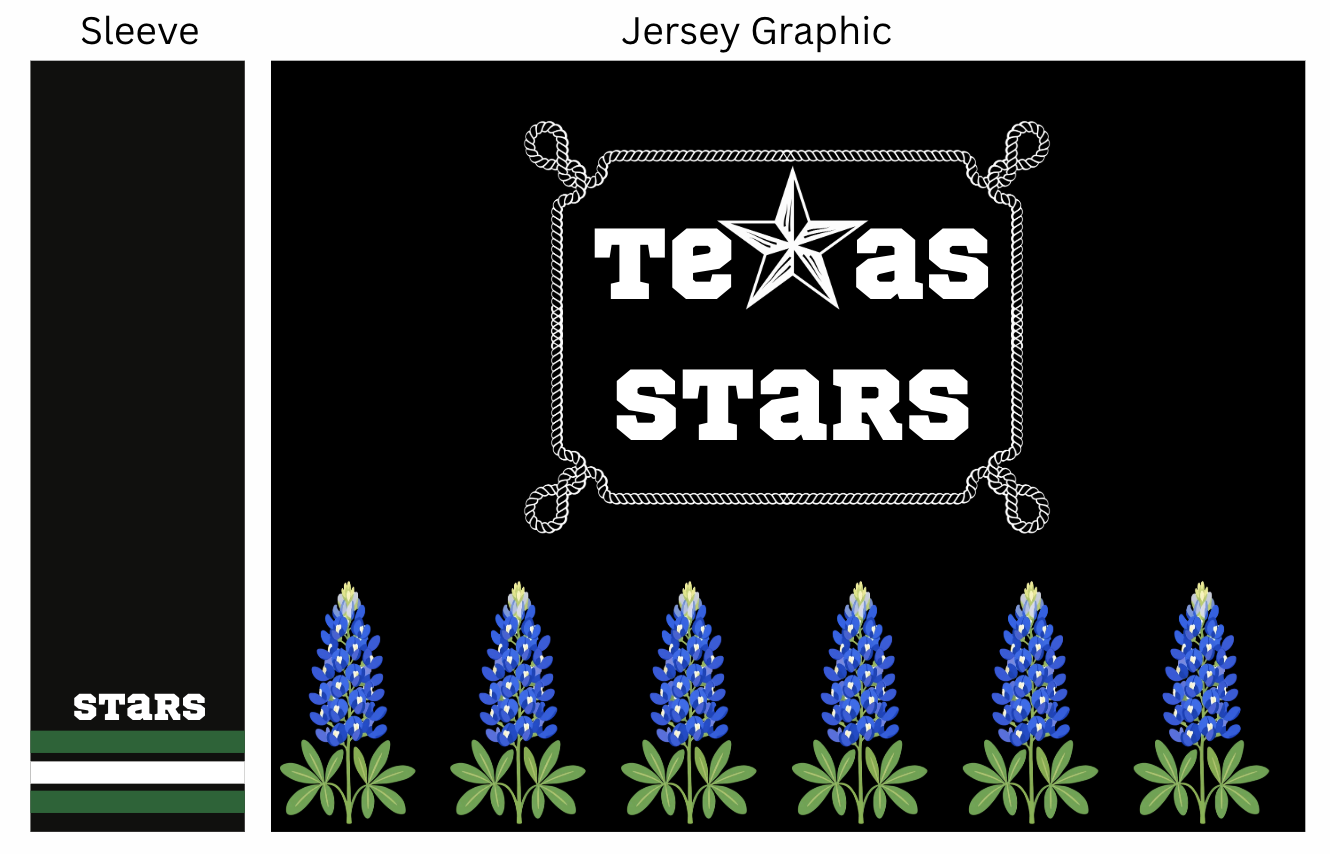
This designs leans more away from rodeo and western, and more towards a Texas specific feeling. These bluebonnets are enlarged to showcase the coloring and visuals. I imagine these to be smaller and lining the bottom of the jersey with the stems acting as the green tie in for the team colors. Tying these flowers into the rest of the jersey could be done with petals or another small graphic that doesn’t distract from the logo. The rope needs to be spun in the same direction as well. The star in Texas - similar to the regular logo- is shifted to look more like a rough Texas star in this version.